
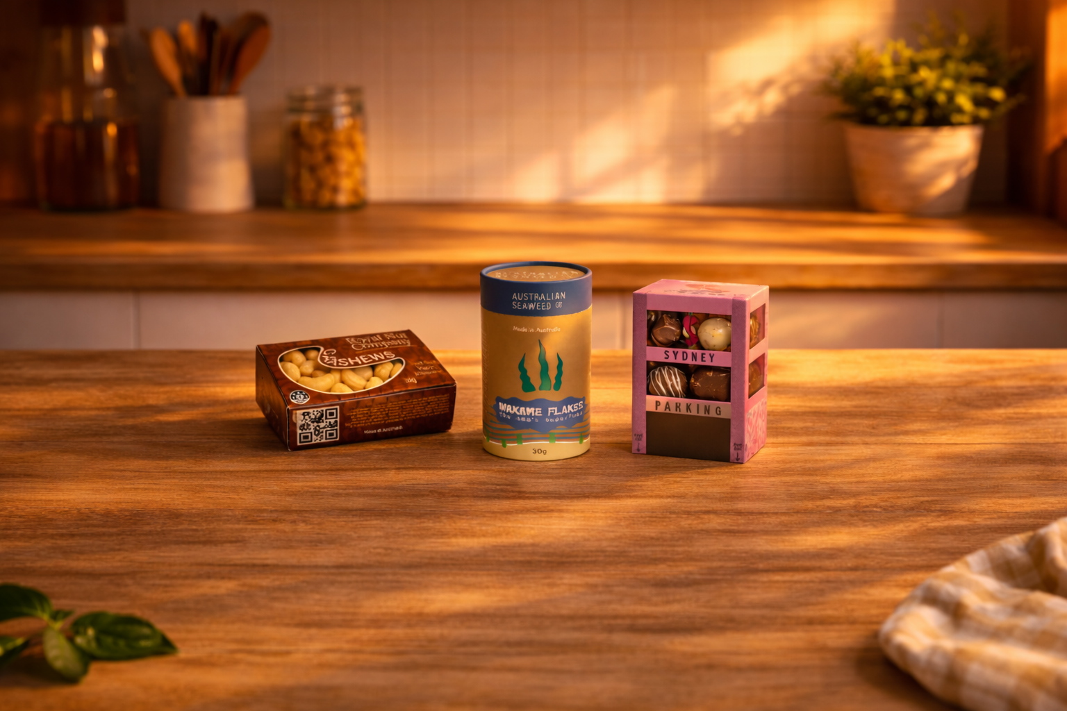
I have developed my packaging design skills through creating a range of products that focus on both visual appeal and real world use. My work includes snack boxes with clear windows, cylindrical containers, and structured display packaging, all designed to feel realistic and ready for retail. I have explored how materials, layout, and form work together to present products clearly while building a strong brand identity across different styles.
Packaging
Packaging
I have developed my packaging design skills through creating a range of products that focus on both visual appeal and real world use. My work includes snack boxes with clear windows, cylindrical containers, and structured display packaging, all designed to feel realistic and ready for retail. I have explored how materials, layout, and form work together to present products clearly while building a strong brand identity across different styles.
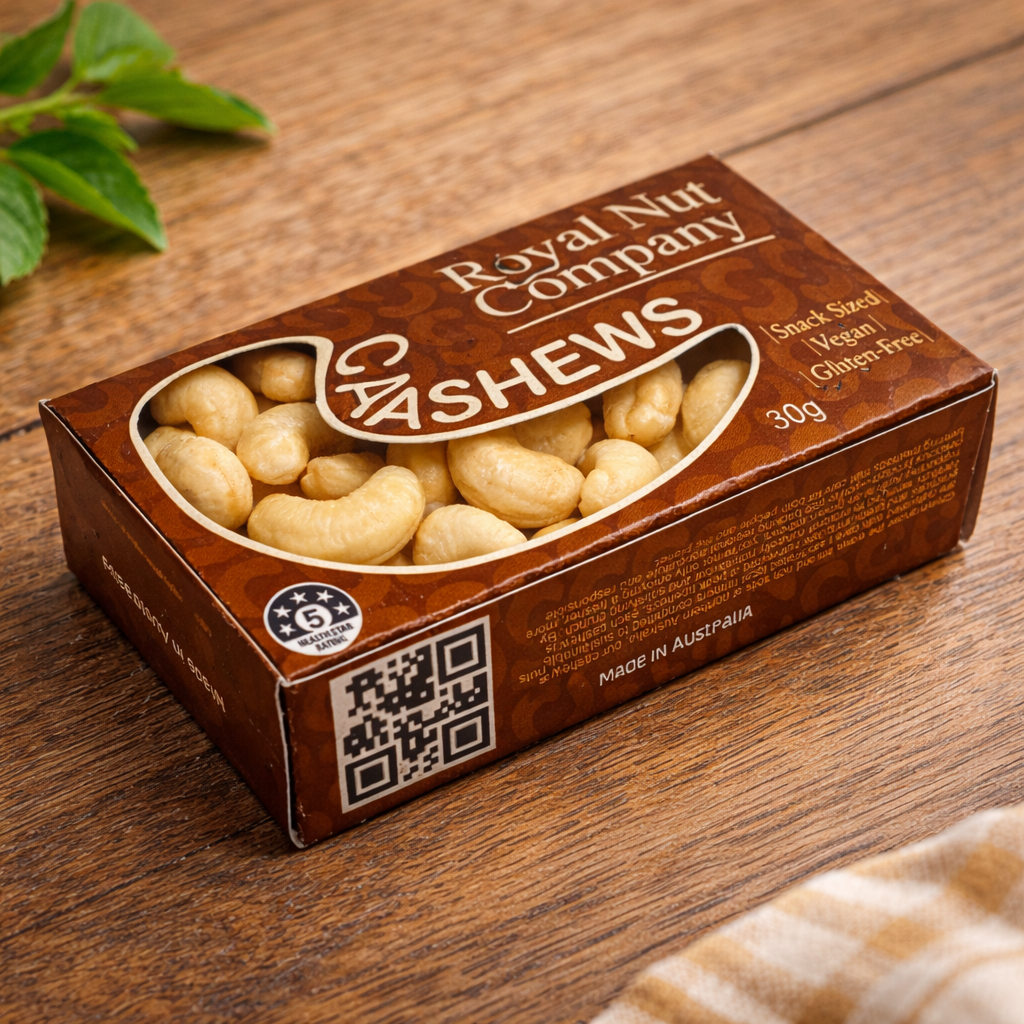
Cashew nut - snack box
The Royal Nut Company
My cashew nut packaging design focuses on creating a clean and functional product that feels realistic and ready for retail. The goal was to design a snack sized box that is visually appealing while clearly showcasing the product inside through a transparent window. I focused on keeping the layout simple and easy to read, using strong branding and clear information to make the product stand out. This design reflects my understanding of how packaging can balance appearance, usability, and shelf presence.
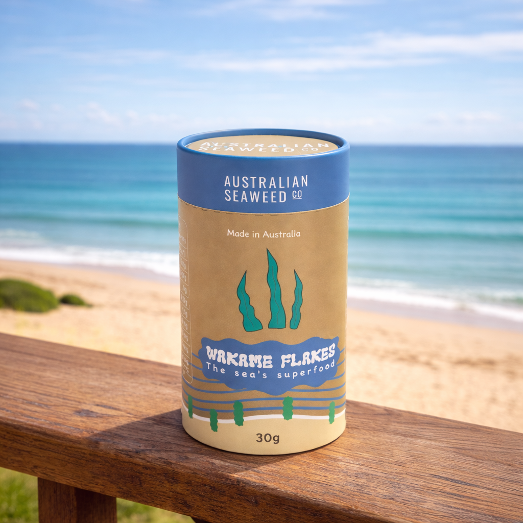
Wakame Flakes
Australian Seaweed Co.
My Wakame Flakes packaging design focuses on creating a clean and natural product that reflects its connection to the ocean. The goal was to design a cylindrical container that feels authentic and easy to recognise, while clearly communicating the product’s benefits and origin. I used simple graphics and a clear layout to highlight the seaweed and its Australian identity. This design shows my ability to create packaging that feels cohesive, informative, and suited to its product.
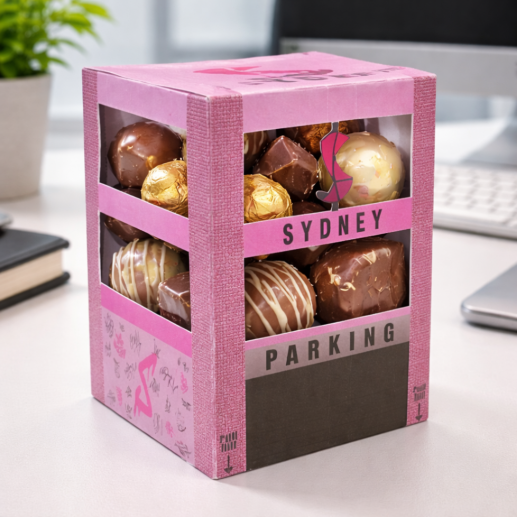
chocolate box
Sydney.com
My Sydney chocolate box packaging focuses on creating a bold and eye catching design that also feels playful and premium. The goal was to design a structured box with open window panels that showcase the chocolates inside, making the product instantly appealing. I used strong colours, clear typography, and a unique form to give the packaging personality and presence. This design reflects my ability to combine creativity with function, creating packaging that stands out while still being practical and easy to use.
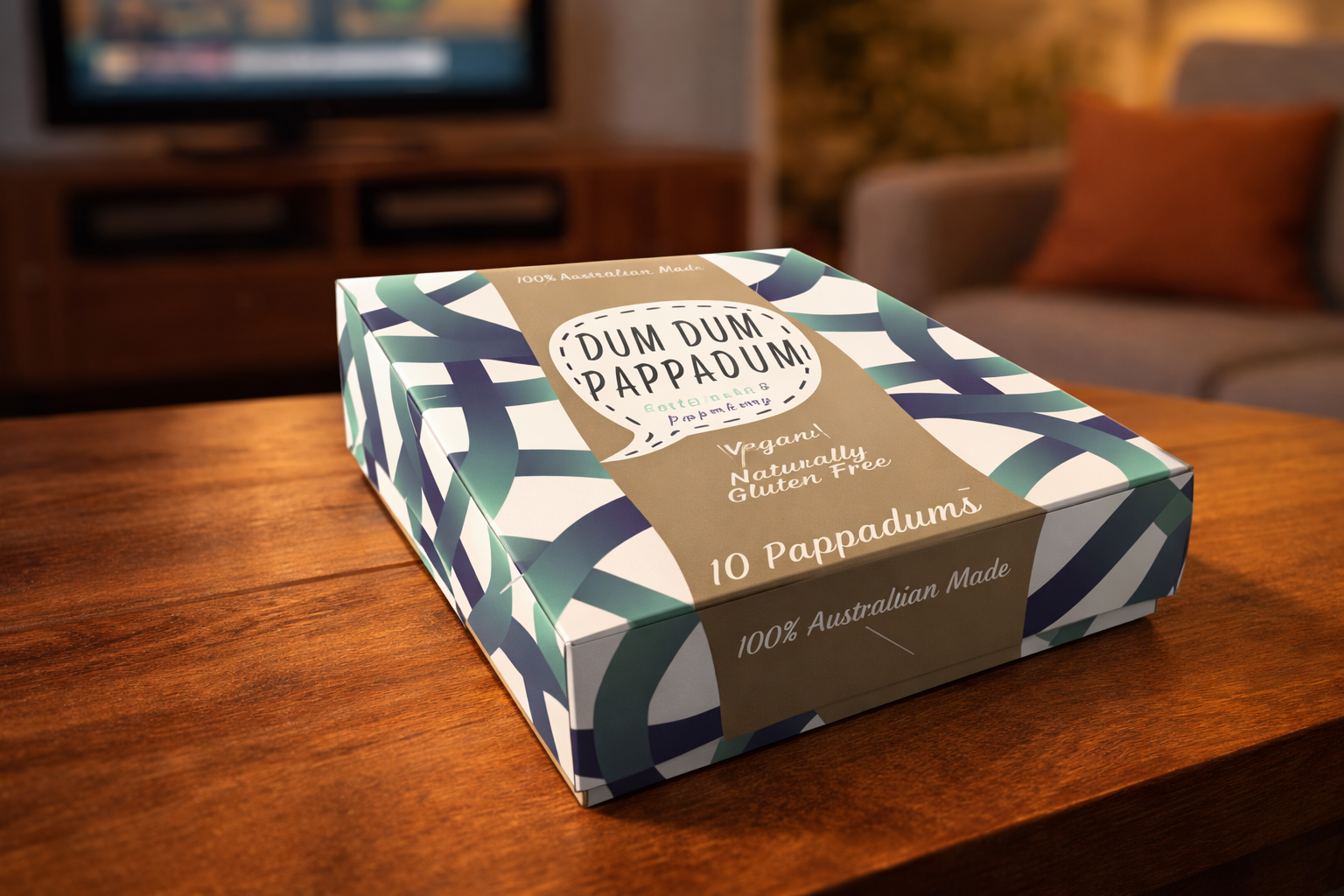
Dum-Dum Pappadum
Swinburne Project
This packaging design focuses on creating simple, bold, and adaptable visuals that work across different flavours, developed through my work with Dum Dum Pappadum, an Australian made brand. The goal was to design packaging that is visually appealing while clearly communicating its local identity and broad appeal as a snack for everyone. Feedback highlighted that a larger logo strengthens recognition, while consistent elements help unify the design. Overall, the layout is clear, versatile, and effective in balancing strong visual impact with practical communication.
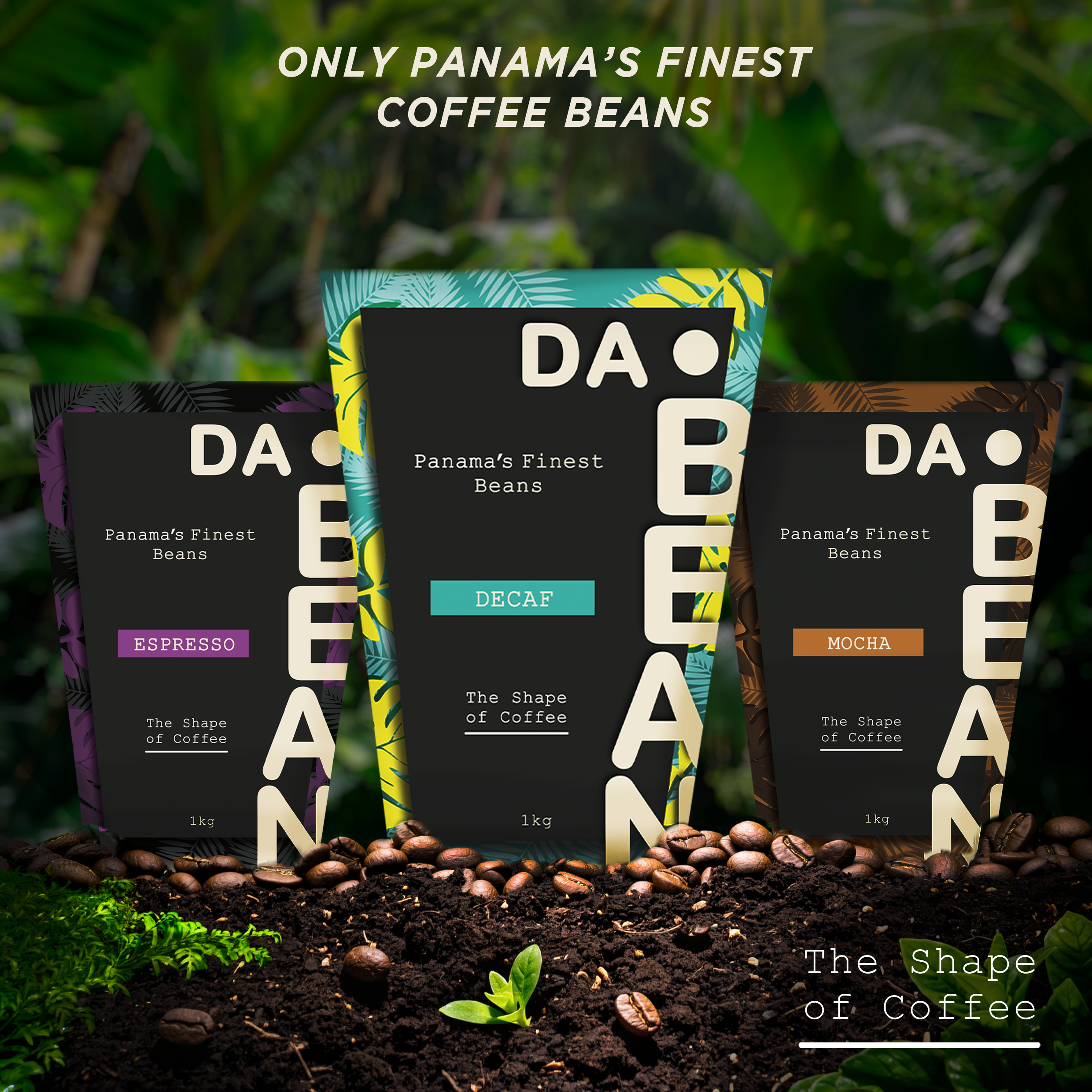
Coffee Beans
Da.Bean
My DA•BEAN coffee bean packaging focuses on creating a bold and eye catching design that feels modern and premium. The goal was to develop a strong visual identity using large stacked typography, vibrant tropical leaf patterns, and colour coded variations that clearly separate each coffee blend while keeping the branding consistent. I used a clean black front panel to make the logo stand out and wrapped the rest of the packaging in detailed illustrations inspired by the origins of Panamanian coffee. This design reflects my ability to combine branding, illustration, and packaging design to create a product that is visually appealing, memorable, and stands out on a retail shelf.